Tables
Cell Flashing
Cell flashing is a useful way to indicate changes or updates in an underlying datamodel.
To make a table cell flash in response to the cell value changing, click on the settings cog of the panel and go to "Style"

Scroll down to the "CELL FLASH" section where you can configure the different options.

Tip
To turn cell flashing off, set the flash duration to 0 milliseconds.
Additional details:
- Flash duration is in milliseconds.
- "Flash Up Color" is the color the cell changes to when the cell value goes up/increases.
- "Flash Down Color" is the color the cell changes to when the cell value goes down/decreases.
Note
Correlation ID needs to be set in table panel's settings in order for cell flashing to work. Ideally this should be set to either the primary key, or to a column whose values are not changing.
Columns
Table columns are highly versatile allowing users to display information beyond simple text or numeric data.
Columns can be edited to contain a variety of different data formats, including images. See below for some examples of how 3forge table columns can be formatted.
Progress Bar
Use column formatting to create a column that acts as a progress or loading bar for a given row. This can be a great visual indicator for quickly determining how complete a given action is.
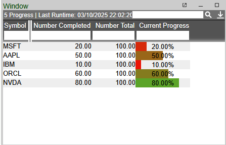
Consider the following table:

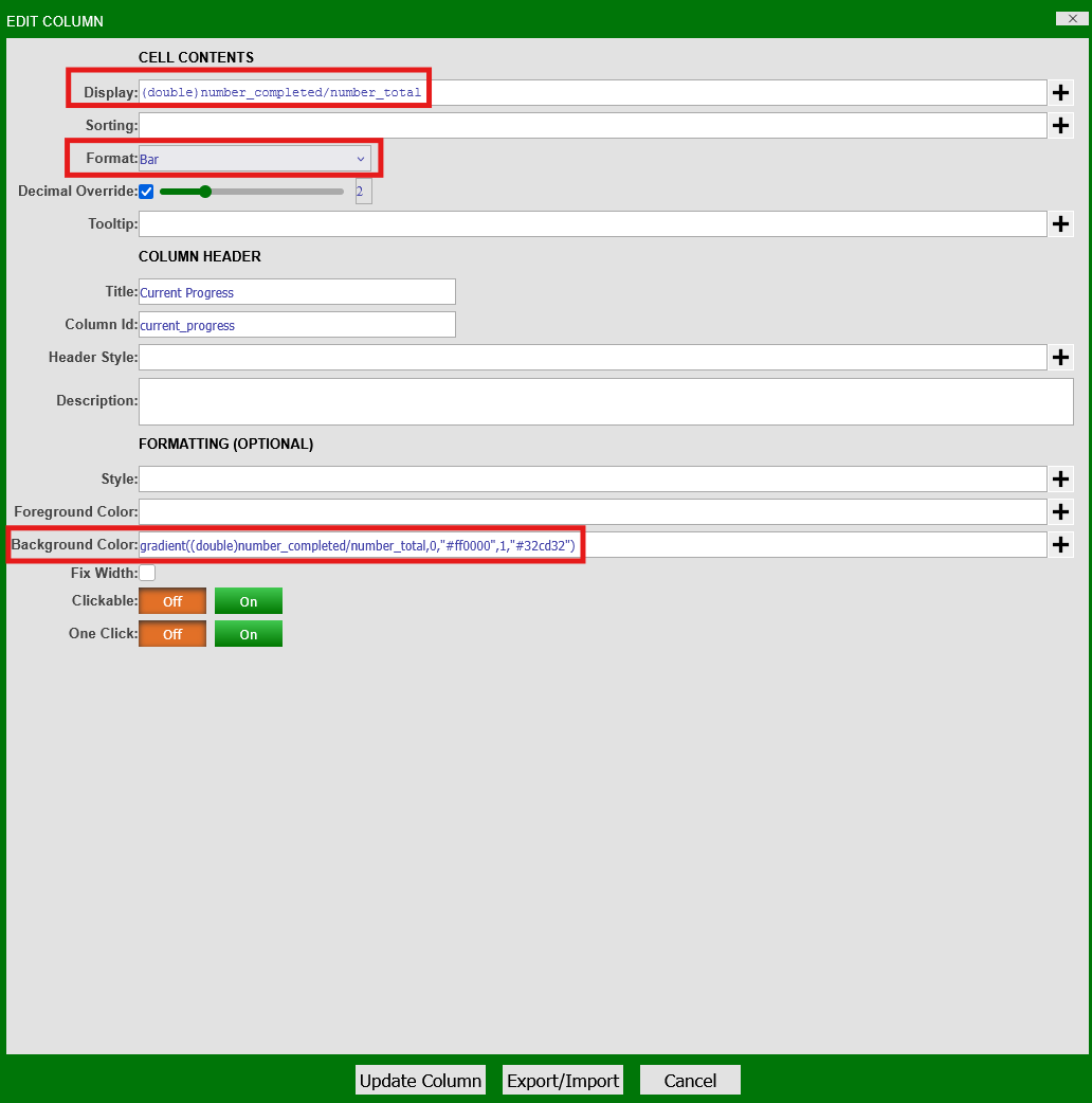
Using the table panel settings (the green cog), add a new column titled "Current Progress" and assign it a unique column ID.
To make this new column act as a progress bar, we will use the following options:
- Set the format of the column to "Bar"
- Change the background color of the cells as a gradient to indicate completeness
Edit the column by going to the table panel's settings and clicking Edit Column and set the following options:
-
In the "Display" option:
This sets the value of the column to the progress level of the current row -
Select "Bar" from the "Format" drop-down menu
-
In "Background Color":
This sets a red-green gradient applied to the value of the cell (current progress level) where:
- 0 indicates least complete (red)
- 1 indicated fully complete (green)
Applying the changes to the table:
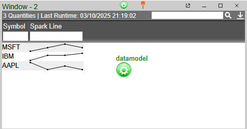
Spark Line Charts
Spark lines can be directly integrated into table columns as a visual indicator for trends in your data.
Spark lines are easily added via column formatting in the settings of a table panel:
-
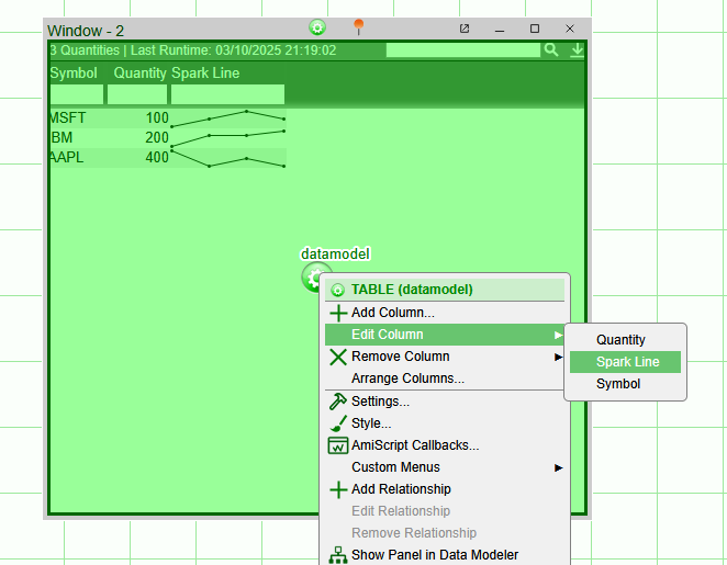
Click on the table panel's settings (the green cog) and navigate to Edit Column.
-
Then, select the column to display the spark line in:
-
Under the "Format" drop-down menu, select the "Spark Chart-Line" option:
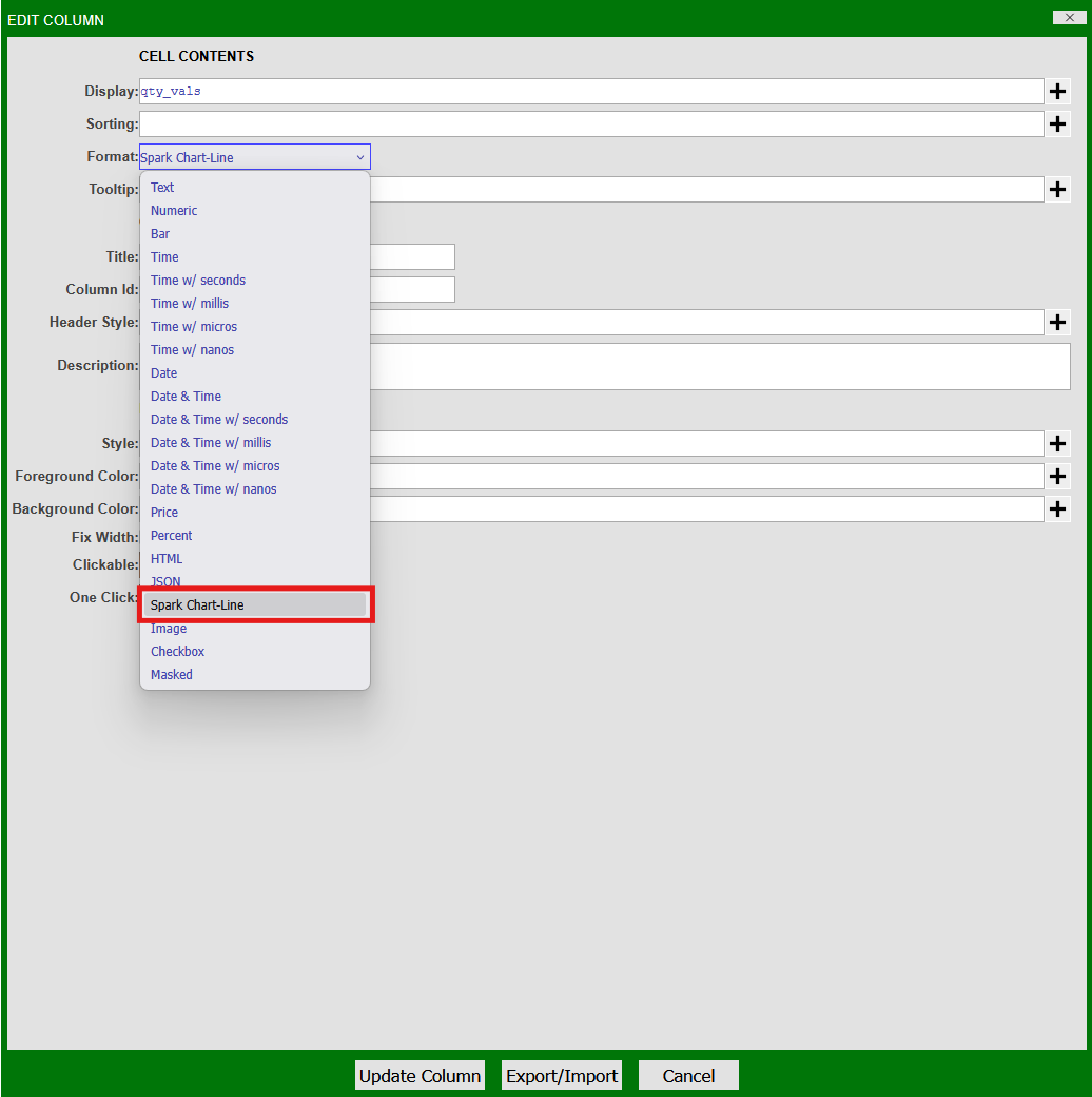
Note
The valid display option for a spark line chart is a string of comma-delimited numeric values, e.g: "1,2,3,4,5".
Consider the following datamodel populated with some data:
To display a spark line chart of this data, we create a second table within the datamodel with an additional column containing a string of different quantity values:
The column "qty_vals" can now be edited into a spark line using the instructions above: