Tables
Tables, or Table Panels, are the primary way to view tabular data in AMI.
There are two types of Table Panel visualizations:
- (Static) Table
- Realtime Table
Note
Table Panels and their associated visualizations are hosted in AMI Web. Tables created this way are stored as Table objects.
Realtime or Historical Tables are hosted in AMI Center and are created via the AMIDB Shell Tool.
Create Table Panel
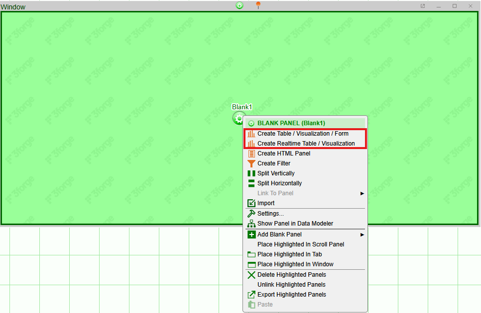
To create a table, create a new window or blank panel in Windows -> New Window then click on the cog wheel and select "Create Table / Visualization / Form" or "Create Realtime Table / Visualization / Form":
This opens the Data Modeler where you can select the datasource or datamodel on which to build the visualization.
Static Table Visualization
Static tables are built on datamodels. Datamodels sit in AMI Web and can be viewed in the Data Modeler.
To create a static table:
-
Find or create the datamodel you want to build a visualization on. The instructions for this are in the datamodel page.
-
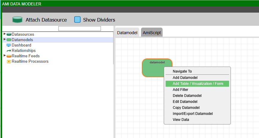
Right-click on the "Create Table / Visualization / Form" button in the panel drop-down menu. This will open the Data Modeler.
-
Find the datamodel and right-click on it, choosing "Add Table / Visualization / Form".
-
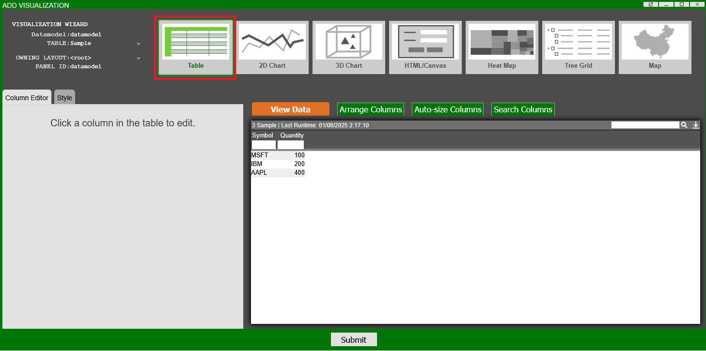
This will open the "Add Visualization" window. Select the "Table" option. This will give you a preview of your datamodel's data and how it will look as a table.Press "Submit".
The panel will now be a table of the selected datamodel.
Realtime Table Visualization
Realtime visualizations are best for data that is continually changing and where the visualization needs to update in real-time.
Realtime visualizations are created on realtime feeds which correspond to tables in an AMI Center.
Note
Unlike datamodels, complex transformations cannot be done in realtime visualizations. Users can however use advanced column customization to modify how the data is visualized in the table, without affecting the underlying data.
If complex transformations are required, such as joining data from multiple feeds, use Realtime Datamodels instead.
To create a realtime table:
-
Find or create the realtime feed you want to build a visualization on. Information on Realtime Tables in the Center can be found here.
-
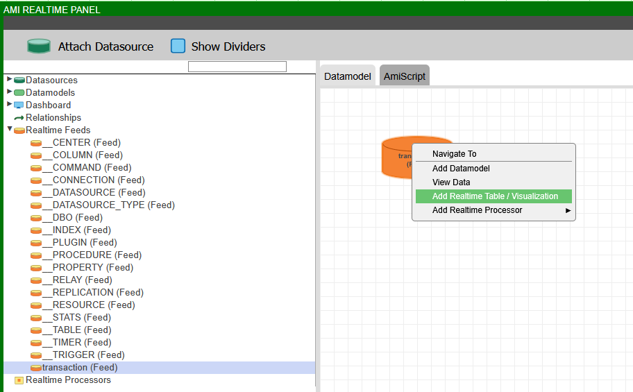
Right-click on the "Create Realtime Table / Visualization / Form" button in the panel drop-down menu. This will open the Data Modeler.
-
Find the Realtime Feed and right-click on it, choosing "Add Realtime Table / Visualization / Form".
-
This will open the "Choose AMI Data" window. Select the "Table" option. This will give you a preview of the columns from the feed, whether to include them, and what data type the columns should use. Press "Create".
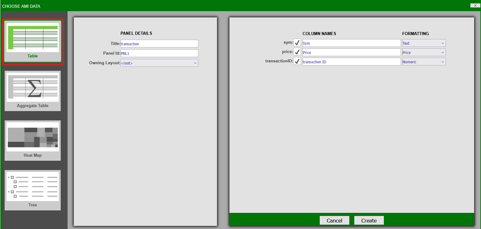
The panel will now be a realtime panel displaying the data of the selected feed.
Aggregate Tables
Aggregate tables are real-time tables that can be used to obtain a summary of data grouped by certain variables. Aggregate tables will integrate changes to the data in real-time.
To create a real-time table, click on the green configuration button on a blank panel and select Create Realtime Table/Visualization from the menu. This will open up the real-time visualization wizard. In the wizard, select the Aggregate Table icon and the data you would like to aggregate. Click Next to view the aggregation options.

In the last step of the wizard, choose the variables to Group By (or hide) and the variables to perform aggregations on. The types of aggregations available are: Count, Sum, Max, Min, & Average. Click Finish to create the aggregate table.

The group by columns will be in bold.
Aggregate Table Settings - Grouping Columns for Aggregation
A unique setting found in aggregate tables is the option to choose how hidden grouping columns affect the aggregation.

When set to Hidden and Visible, the table will consider all grouping columns (including hidden columns). When set to Only Visible, hidden grouping columns will not affect the aggregation.
This is useful when you would like to temporarily change the aggregate view without deleting any grouping columns.

The aggregate table when set to Only Visible and CIOrdID is hidden
Columns
Columns in AMI are fully customizable. Users can freely add new and edit existing columns, even after table creation.
Change the display, format, and data-type of a column in the table with a wide range of functions for easy readability.
Note
This does not affect the underlying data, only how it is displayed in the Web.
Adding, Editing, Copying, & Deleting Columns
Adding
There are three ways to add columns in tables:
1. Click on the green button to bring up the panel configuration menu and select Add Column

2. Click on a column to bring up the column menu. This method allows you to place the new column in between existing columns. In the menu, select whether to add the new column to the right or left of the selected column

3. Click on an open area of the header in order to bring up the header menu. In the menu, select Add Column.

Add Column menu
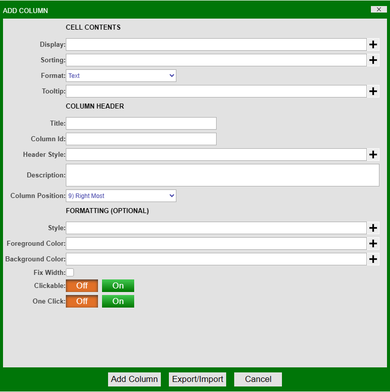
Cell Contents
| Option | Description |
|---|---|
| Display | Use variables, operators, functions, and icons to create the content for the column |
| Sorting | Use variables, operators, and functions to apply a sorting to the contents of the column |
| Format | Choose the format of the column (e.g: text, numeric, time, date, price, etc.) |
| Tooltip | Create a tooltip for cells users hover over |
Column Header
| Option | Description |
|---|---|
| Title | Create a title for the new column. Must be unique from existing columns. |
| Column Id | Add a column ID for the column. This cannot be changed after creation. |
| Header Style | Apply different fonts, alignments, style, and colors to the column header. |
| Description | Add a description/help which can be seen when clicking on the column header. |
| Column Position | Drop down list of various positions where the new column can be placed (can also be hidden). |
Formatting
| Option | Description |
|---|---|
| Style | Apply a style to the contents of the column (including font and alignment). |
| Foreground Color | Apply a color to the contents of the column. |
| Background Color | Apply a background color to the column. |
| Fix Width | Fixes the width. |
| Clickable | Makes the contents of the column clickable. |
| One Click | Selectable with one click. |
Examples
Adjusting header and column styles

Column Description


Tooltip


You can also render HTML in the tooltip. Below shows a table that can be rendered through html in the tooltip. Make sure that you place your HTML in quotes in the tool tip field. You can place more complicated logic in custom methods to render tables in html such as below in the tooltip.

Editing
There are two ways to edit columns
1. Click on the header of the column to bring up the column menu and select Edit Column

2. Click on the green button to bring up the panel configuration menu. Highlight Edit Column to bring up the list of columns and select the column
Both options will open the Edit Column window, which is the same as the Add Column window.
Example
Conditional Formatting
Formatting can be used to highlight data in specific formats when certain parameters are met. In this example, the Price is set to be in bold red and highlighted if it is greater than \$50.


The onEdit Callback
This callback is triggered whenever a value in the table is edited and then saved. This does not trigger if the value is the same as its original state when saved; if the value has been changed and then reverted to it's original state before being saved it will not trigger.
Two tables are returned when triggered, vals and oldVals.vals contains the latest version of the edited cells while oldVals contains the original values before being saved.
The values stored inside these tables are defined using the edit column menu. The menu can be accessed by left clicking the header of a column and choosing the edit column option from the dropdown box as shown above. Looking at the cell editing section of this menu allows the user to define how they want this column's data to be accessible to the user.
Example

At the bottom of the menu there is an option labelled clickable, when this is set to On the user will be able to double click cells in this column and edit them in real-time. The data in the table backing the table visualisation will only be changed if the user has written a specific script to do so.

There are multiple options available, the readonly option allows the user to include the value of the cells in the vals and oldVals tables. The other options define the datatype of the new value that is entered into the edited cell, this datatype must match the original type of the cell.
Copying
In order to copy a column, click on the column to be copied and select Copy Column. This will bring up the Edit Column menu. Apply a different name and click Update.

Note: if the column to be copied has any input in its fields, those fields will also be copied.
Deleting
There are two ways to delete a column.
1. Click on the column header and select Delete Column from the column menu. There will be a confirmation prompt before final deletion.

2. Click on the green button to bring up the panel configuration menu. Highlight Remove Column to open a list of all the columns in the table. Select the column to remove.

Sorting
Columns can be sorted in multiple ways
Primary Sorting
Primary sorting will remain in place until it is cleared. Any new data added to the table will automatically be sorted. There are two ways to add a primary sort to a column.
1. Click on a column to open the column menu. Select either Sort Ascending or Sort Descending

2. Hover over the column header - this will bring up the sorting arrows on the right side of the header. Clicking on the up arrow will apply a sort in ascending order & clicking the down arrow will apply a sort in descending order

After applying a primary sort, the corresponding arrow indicating the type of sort will appear in the header

Application of a descending sort
In order to cancel a primary sort on a single column, use the Sort Ascending Once or Sort Descending Once options from the column menu. This will perform a sort which will not remain in place and the primary sort will no longer be applied to the column.

Secondary Sort
Secondary sort can be used to further sort the data based on multiple columns. The secondary sort option will not be available unless there is a primary sort in place on one of the columns.
Example

Table without any sorting applied

Sort Ascending applied to Continent

Secondary Sort applied to Region

Secondary Sort applied to Name
In order to clear all of the sorts on a table, click on any column and select Clear All Sorts from the column menu.

Pinning & Sizing
When working with large tables, it may be necessary to keep certain columns pinned. To do this, select the column to be pinned and select Pin To This Column. That column and every column to the left will be pinned.

The header of pinned columns will be in bold and a vertical line will appear as you scroll to the right of the table.

Use Clear Pinning to clear all pinning.
You may manually resize columns or have it done automatically. To resize any column, hover over either edge of the header, click and drag to the desired size. To have this done automatically, using the width of the longest record(s) in the column(s), select Auto-Size This(All) Column(s) from the column menu.

You can also click on an open area of the header in order to bring up the header menu. In the menu, select Auto-Size All Columns
Filters
To apply a filter to a column, click on the column header and select Filter from the column menu. This will open the Filter window.

| Filter By | Drop down list to determine whether or not to show/hide based on exact/pattern match |
| Match Selected Values | List of all of the unique records in the column. Select or more records to filter on. |
| Custom Value | Input specific value to filter on (may be a record that is not in the column yet) |
| At Least | Include or Exclude record in the At Least field |
| At Least | Input specific value to be the minimum |
| At Most | Include or Exclude record in the At Most field |
| At Most | Input specific value to be the maximum |
| Include null | Check to include null |
When a filter is applied, the column header will be highlighted in orange.

Quick Filters
A faster way to apply filters to a column is to use filter fields (quick filters) in the column headers. Quick filters are on by default but you may disable this in the panel's Style menu (panel configuration menu > Style > Column Filter). You may adjust the style of the filters using the same menu.

When you click on a quick filter field, a autocomplete list will open. This will be a list of all of the unique records that are in the column. Select a record to apply a filter based on that record.


You can also narrow down the list by typing a few letters/numbers.

When working with number columns, you may use operators to specify ranges (in addition to searching for an exact match)


For advanced users, Quick Filters use the following logic:
- If your filter contains any of
>>=<<=-it is treated as a range query e.g.>100returns all rows with value greater than 100,10-20returns all rows with values between 10 and 20. -
If the filter does not contain any of these characters, then it follows the Simplified Text Matching with two exceptions:
-
.is not a single character wildcard e.g.a.cwould hide the value abc - Filters are treated as if they start with
^and end with$e.g.APwould hide the value AAPL
There are two ways to clear a quick filter:
-
Use the Clear Filter option in the column menu. Note: this will clear both regular and quick filter for that column.
-
Press ESC when the quick filter is focused.
Arranging & Hiding
There are 3 ways to access the Arrange Columns window.
1. Click on the green button to bring up the panel configuration menu and select Arrange Columns

2. Click on a column to bring up the column menu and select Arrange Columns

3. Click on an open area of the header in order to bring up the header menu. In the menu, select Add Column.

You can also click and drag a column to its desired position.
Arrange Columns Window

All of the columns of the table are listed in the Visible Columns section in the order they appear. You can use the control buttons on the left side of the box to move the selected column(s).
The Hidden Columns section will contain the columns you choose to hide from the table. Use the control buttons in the middle to switch a column from being visible to hidden.
The Search field at the top can be used to search for specific columns. As you type, matching columns will be highlighted and the number of columns found will be indicated to the right of the field.

When you are done rearranging, click on the Apply button.
Hiding a single column
In addition to using arrange columns to hide columns, you can hide a column directly by clicking on a column's header and selecting Hide This Column. To make this column visible again, use the arrange column window.

Searching
When working on a table with many columns, you can use the Search Columns window to quickly jump to the column.
Click on any column and select Search Columns from the column menu. You can also use ALT + R hotkey to bring up the Search Columns window.

Search Columns Window

As you start typing in the Search field, the Results section will update with the matching columns. After selecting the column from the Results field, you can use the 3 buttons to either move the column to the left/right of the column you clicked on or snap/jump to the column.
Format
You can customize the formatting of table cells.
Custom HTML Formatting in Table Cells:
- Click "Edit Column"
- Under "Cell Contents" choose "HTML" from the format dropdown
- In the "Display" field you can put in the HTML logic
- Make sure it is in quotation marks
- If you are referencing a variable do this
${varName}
- For example, the picture below bolds the names

Custom Image Formatting in Table Cells:
There are three methods where you can upload an image.
Method 1: Uploading to Database
- You can put the image in the database.
- In the example below, imageT is the image
CREATE PUBLIC TABLE images(id Long,filename String,imageT Binary);
- Click "Edit Column" on the column where you want to display the image
- Under "Cell Contents" choose "Image" from the format dropdown
- In "Display" put in the image variable

Method 2: Uploading to resource manager
- It is best to create a custom method. Below is an example of a custom method we created that you can use:
- Go to Dashboard -> Resource Manager
- Right click and select "Upload File"
- Right click on the image you want to upload in the resource manager and click "Get Relative HTTP URL"
- Click "Edit Column" on the column you want to display the image.
- In "Display" you call the custom method such as uploadImg("relative HTTP URL")
- Choose "Image" from the dropdown "Format" menu
Method 3: Upload image through file upload
- Create a HTML panel
- Click on "Add Field/Button/Div"
- Add "File Upload Field"
- Create a custom method. For example, here we created a custom method called insertImage and called it in onChange()

- The image should now be uploaded in the database
Number Columns
When working with number columns, you can quickly change the format of the column contents by using the Format option in the column menu. When available, hovering over the Format option will expand with a list of options available based on the content format.
Note: the underlying data is not changed.
Examples

Column where the cell content format is Numeric

Column where the cell content format is Date & Time

''Column where the cell content format is Date & Time w/ nanos"
Reset all Columns to Defaults
To completely reset and revert any sorting, sizing, filtering, and arranging (note: hidden columns will become visible again), use the Reset All Columns to Defaults option from the column menu.
