Other Panels
Heatmaps
Heat maps allow the user to visualize the data using different colors and sizes; enabling a quick interpretation of large amounts of data. Various colors can be assigned to a range of values. Heatmaps can be either datamodel driven or realtime.
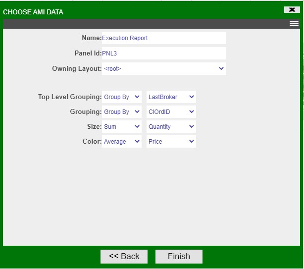
3forge provides 4 options when defining a heatmap:
-
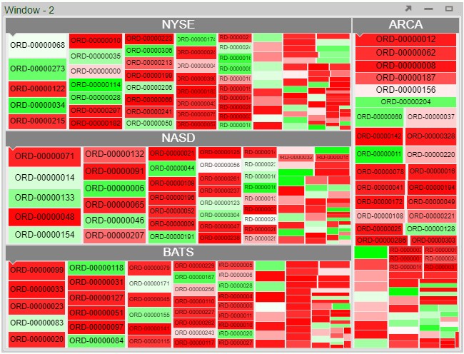
Top Level Grouping: Determines how blocks will be grouped together, e.g. the
NYSEgroup of blocks in the example below. -
Grouping: Determines how rows in the underlying data will be grouped within each block, e.g. the
ORD-00000068block in the example below. -
Size: Determines the size of each block, e.g. the size of each block is the sum of the Quantity column.
-
Color: Determines the color of each block, e.g. the color of each block is the average of the Price column.
Set these values to create the following heatmap:
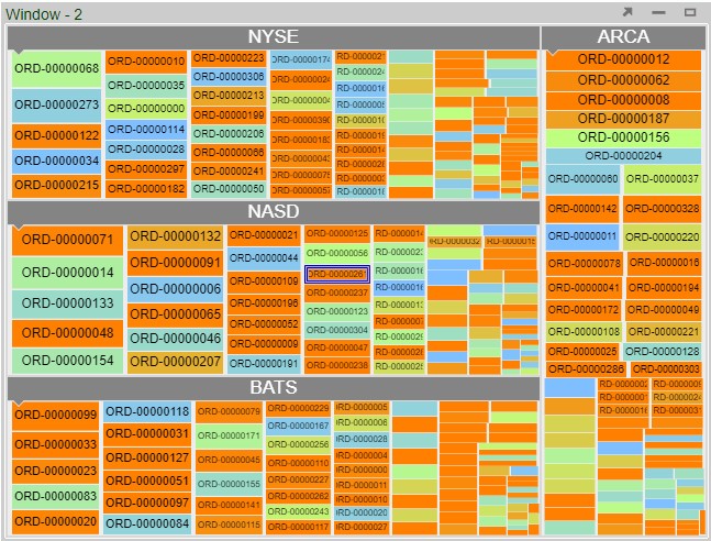
The color gradient can then be set in the panel's Style menu:
Note
Press the spacebar to cancel zoom.
Filters
Filter panels are simple, automatically built HTML panels that provide a dynamic filter for a datamodel. The can be configured to have different input types and to filter based on different columns.
Maps
Maps allow for geographic data to be overlayed on a map. Note that maps require a Mapbox API token to be used.
3D Charts
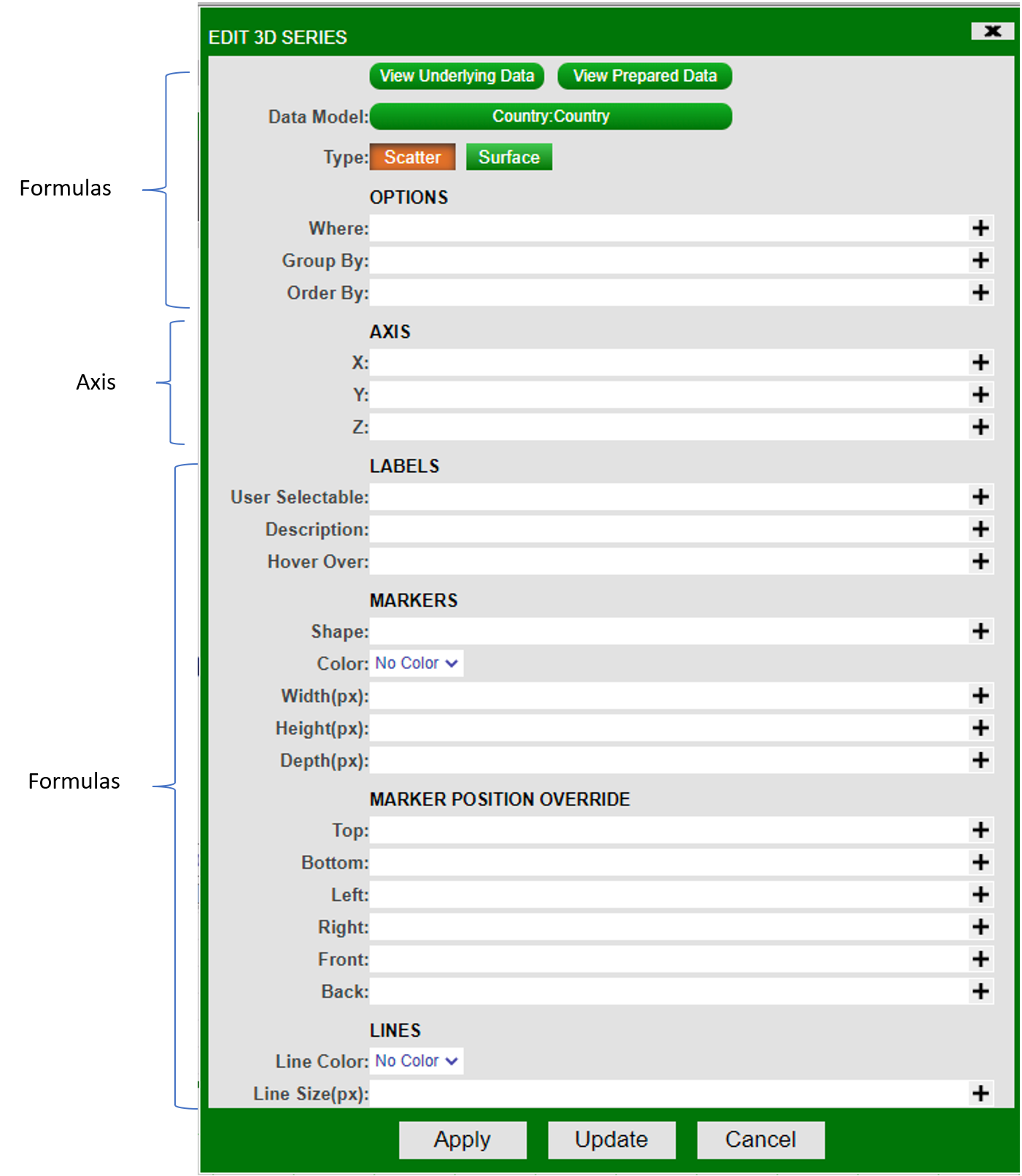
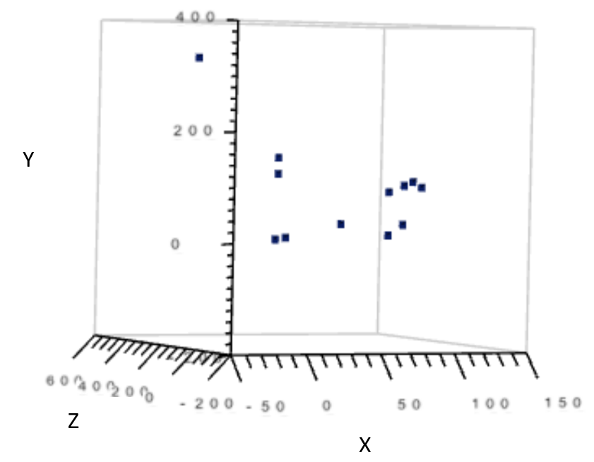
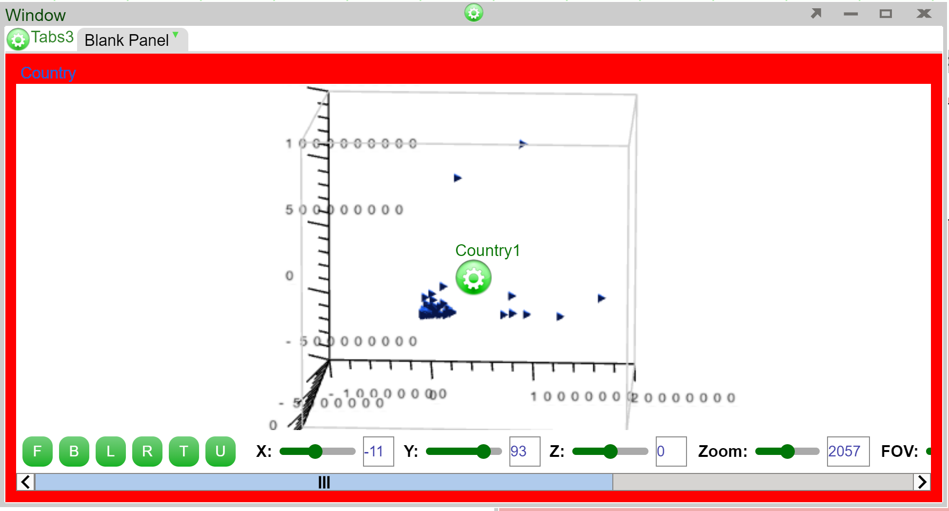
This document explains the usage of each field in a 3D chart. The fields are categorized into 3 sections: formulas, axis, styles. The order of the explanation in this document is based on the diagram below:
Formulas
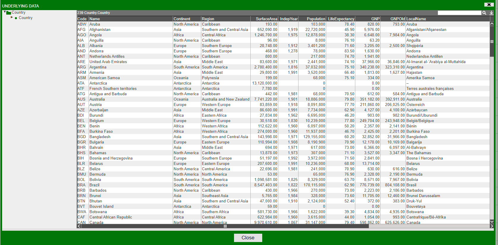
1. View Underlying data to show the data the visualization is going to be based on. Example view below:
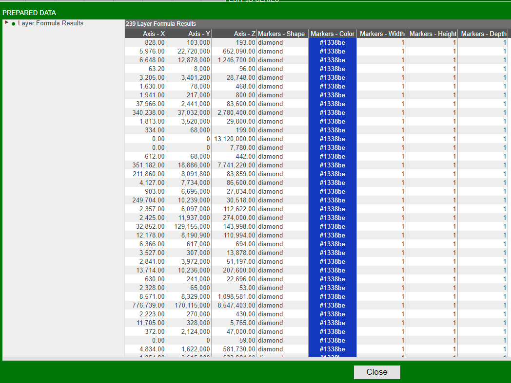
2. View Prepared data to show the underlying data as well as properties of the marker. Properties include:
- Marker Shape
- Marker Color
- Marker Width
- Marker Height
- Marker Depth
- Axis (coordinates) X/Y/Z
Example view below:
3. View data models to show the name of the datamodel of which the visualization is based on.
4. Select a type to indicate whether the graph is a surface plot or a scatter plot.
Options
-
Where: Filters the data based on user-defined, semicolon delimited conditions. The graph would only show points which satisfies the boolean argument (e.g. suppose x-axis is "Quantity". Inputting
Quantity > 0would cause the graph to only show points whereQuantity > 0). -
Group By: Affects the grouping in "View Prepared Data".
-
Order By: Affects the ordering in "View Prepared Data".
Axis
The X/Y/Z Axis indicates what the coordinate values come from. Each axis takes a column's name as input. Column data must be numeric.
Formulas
Labels
8. User Selectable: Determines whether the user can select one or multiple points. Setting this to true enables onSelected() to be triggered upon selection, and the selected values can be retrieved using getSelected().
- Description: Indicates what to annotate next to each data point on the chart.
10. Hover over: Indicates what to show when hovering over a data point.
Markers
11. Shape: Indicates the shape of each data point on the chart.
12. Color: Determines the color of each data point.
13. Width/Height/Depth (px): Determines the size of the data points, in pixels, on the chart.
Marker Position Override
14. Top/Bottom/Left/Right/Front/Back: Forces each marker stretch to the specific value, relative to the range of X/Y/Z.
For exaomple. if one of your markers has position (1x,2y,3z) and your graph has minimum Y value of -5 and maximum y value of 5, and you set Top as 5, then that marker will now stretch to (1x,5y,3z). The previous marker position is not erased so a line is formed, spanning from 2y to 5y. Setting a value outside of the current range will cause the marker line to go outside of the chart. Setting a negative value for Top is equivalent to setting a positive value for Bottom, vice versa. The same rule applies to Left/Right, Front/Back.
Lines
15. Line Color: Indicates the line color.
16. Line Size (px): Indicates the line size, in pixels, connecting the data points.
Styles
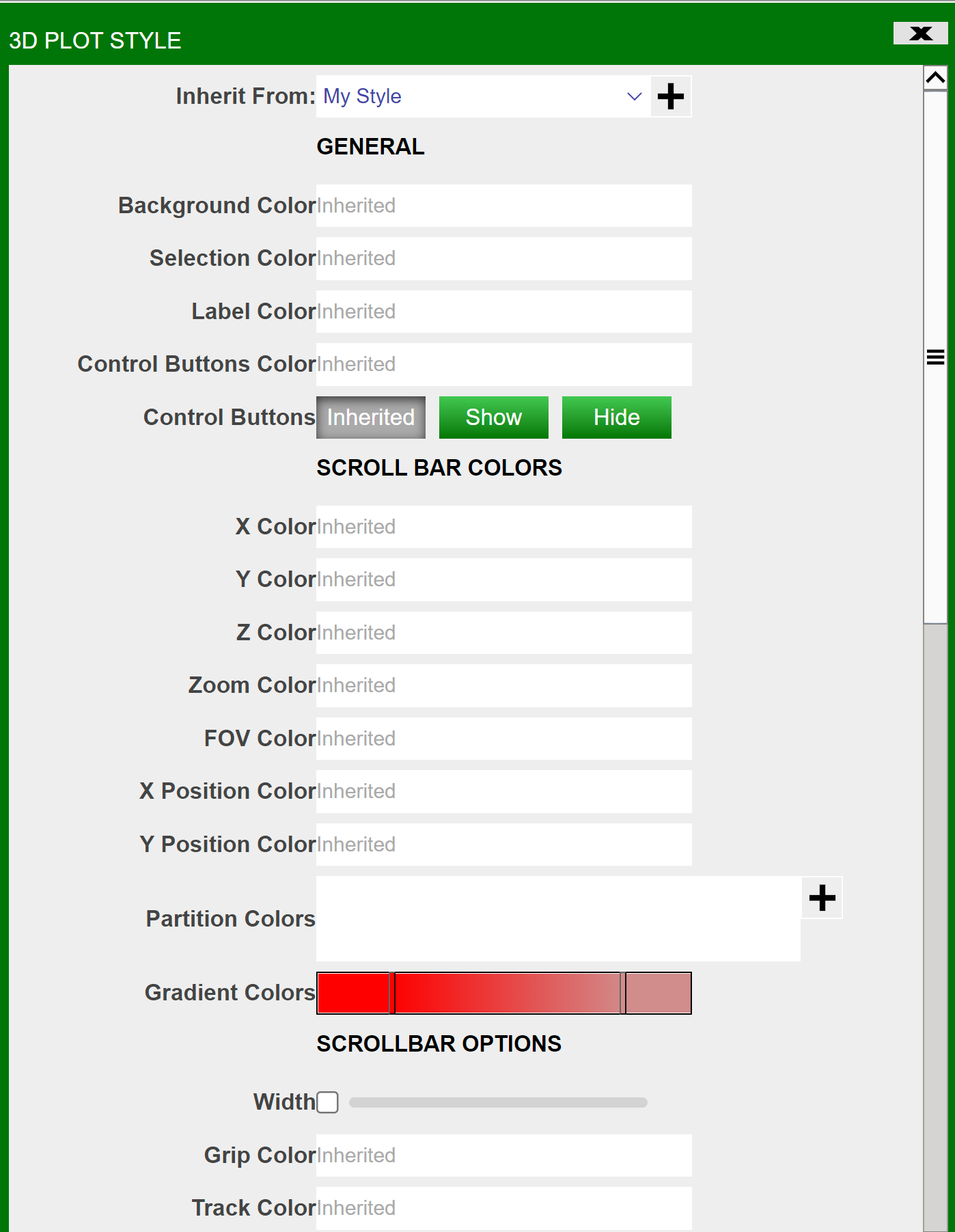
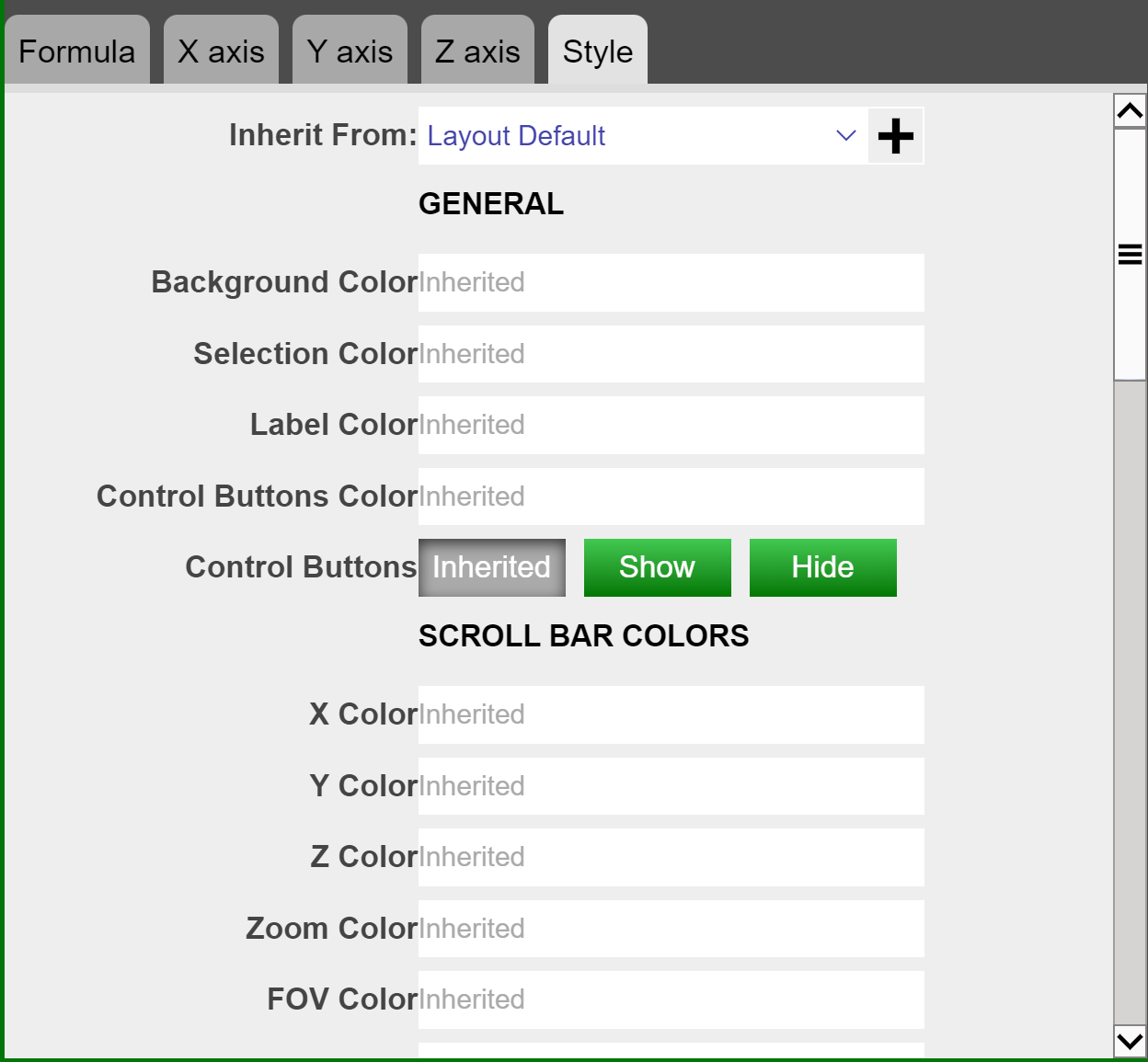
1. Inherit From: Can be changed in Style Manager under Dashboard. This applies the selected styles from the Style Manager.
General
2. Background Color: Applies to the background of the visualization.
3. Selection Color: Affects the color you see when you select a data point on the chart.
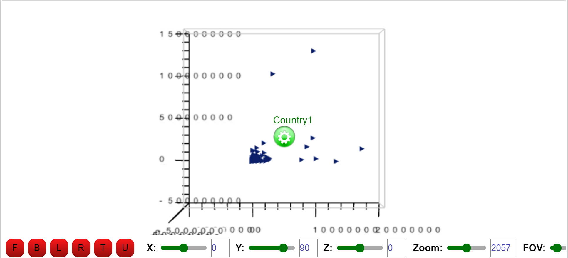
4. Label Color: Affects the color of the labels on the bottom of the visualization. In the screenshot below, one of the labels is set to red:
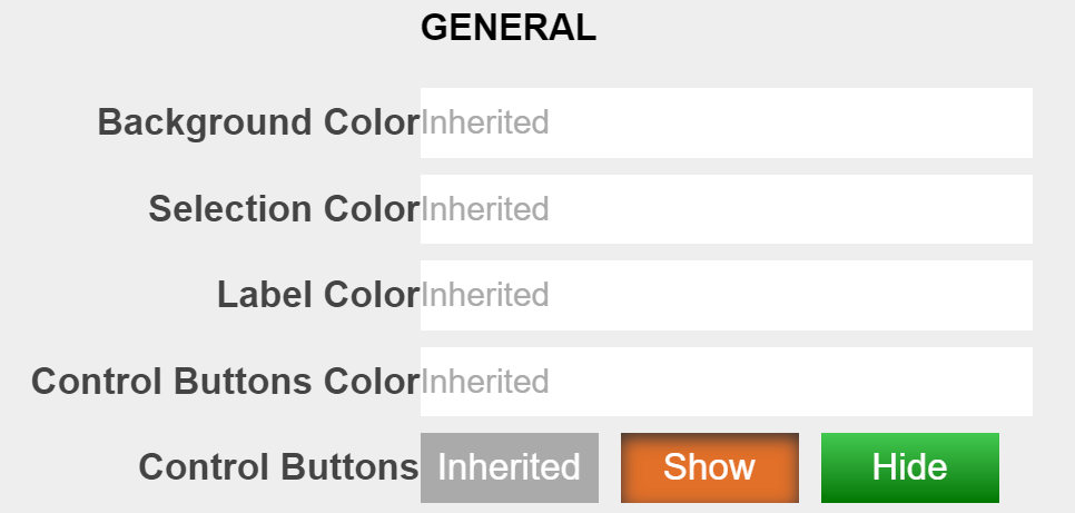
5. Control Buttons Color: Affects the color of the buttons on the bottom left of the visualization as seen below:
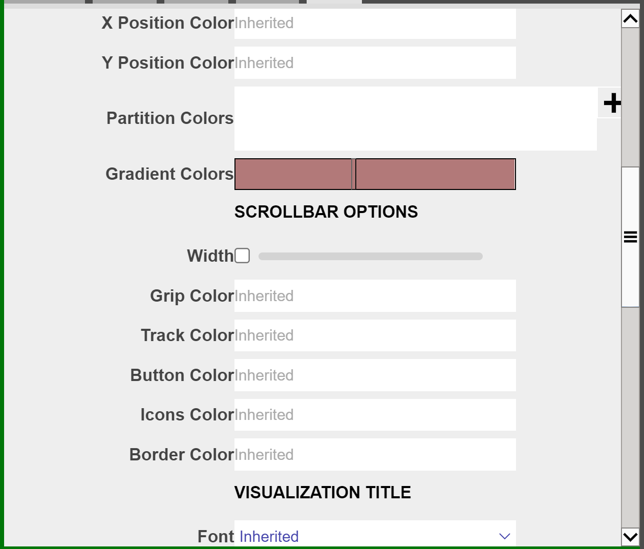
Scroll Bar Colors
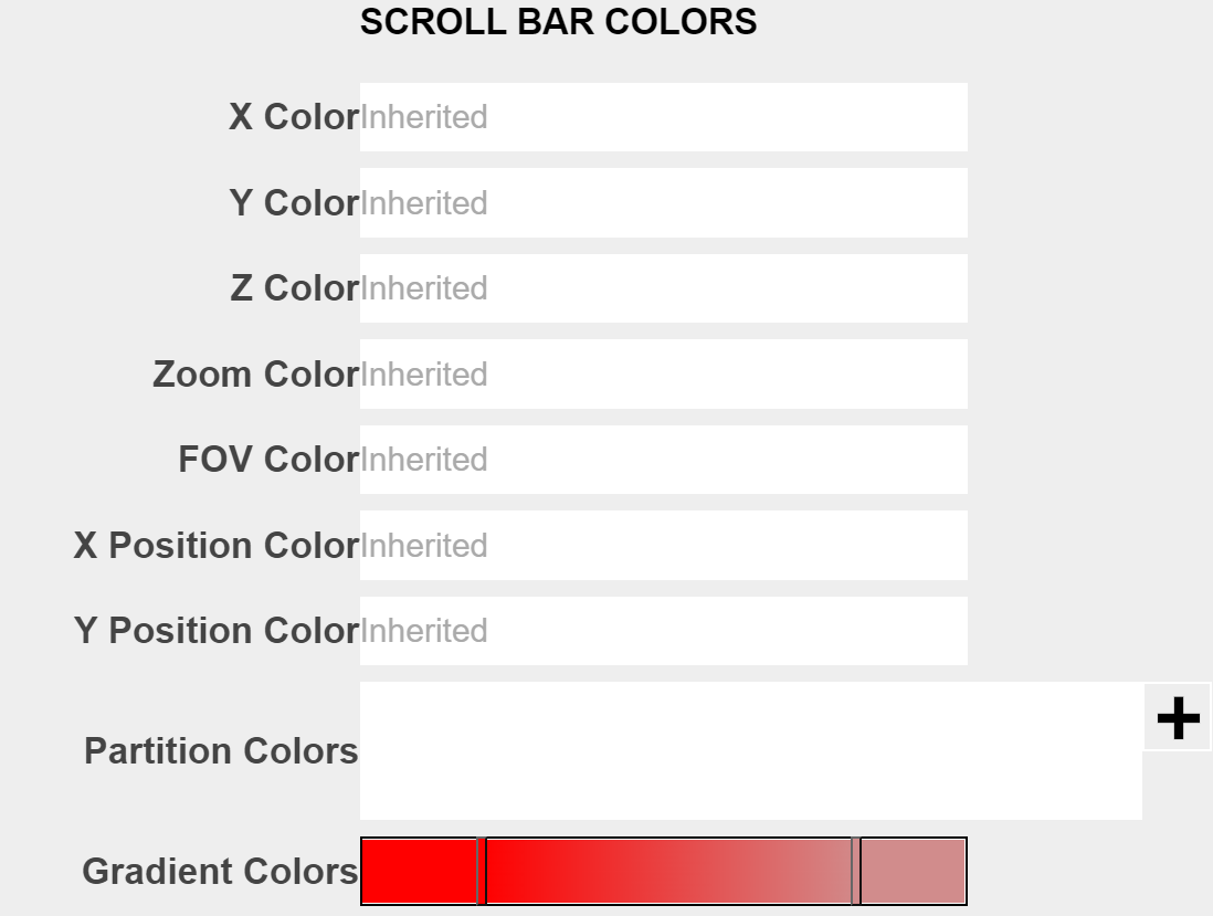
The colors here all refer to the scroll bars on the bottom of visualization, labeled "X", "Y", "Z", "Zoom", "FOV" and such.
Scroll Bar Options
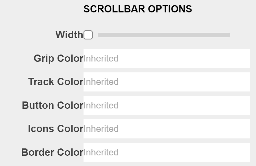
The options here all refer to the <em>single</em> scroll bar at the bottom of the visualization.
Visualization Title
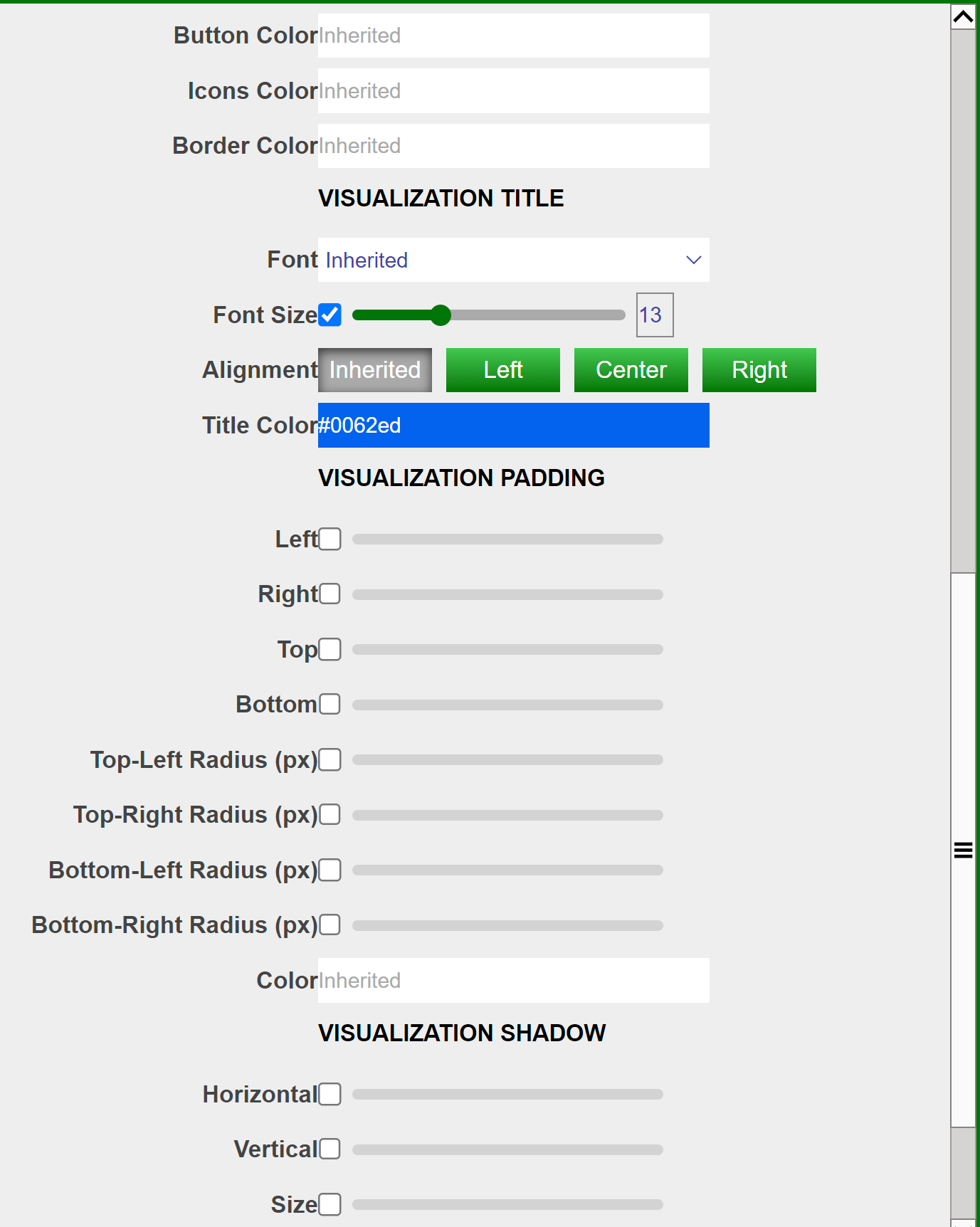
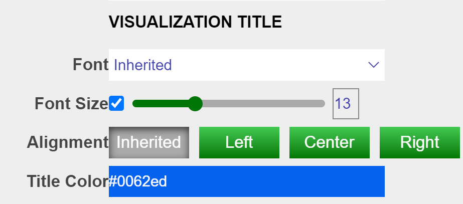
The options here control the title of the visualization. By default there is no title displayed on the chart. Below is an example usage:
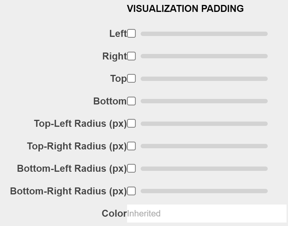
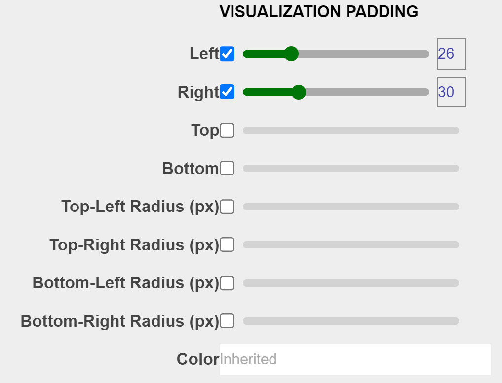
Visualization Padding
The options here control the padding of the visualization as a whole, the padding will cover the chart if set as a high value. Example usage below:
Visualization Border
The bigger the size, the less space there is for the visualization, the bigger the borders. Color controls the border color. Example usage below:
3D Charts PDF
Examples
Candlestick Chart
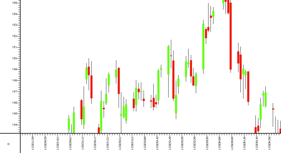
A candlestick chart can be built using 3forge through the following steps:
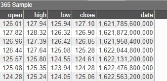
- Create an empty 2D chart visualization on top of your datamodel. For this example, use the following sample datamodel:
-
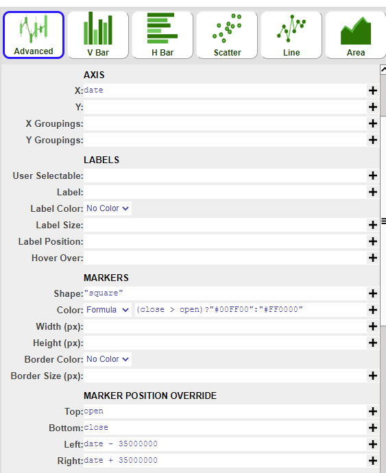
Using the advanced option, create the candle layer first with the following parameters:
1 AXIS X date 2 MARKERS Shape "square" 3 MARKERS Color - Formula (close > open ) ? "#00FF00" : "#FF0000" (Optional - to differentiate bars) 4 MARKER POSITION OVERRIDE Top open 5 MARKER POSITION OVERRIDE Bottom close 6 MARKER POSITION OVERRIDE Left date - 35000000 7 MARKER POSITION OVERRIDE Right date + 35000000 -
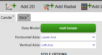
Add a new layer on top of the chart (stick layer):
-
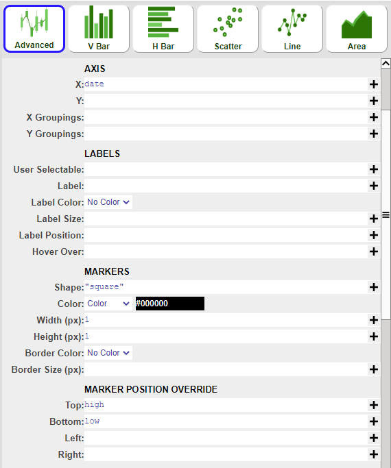
Using the advanced option as well, create the stick layer with the following parameters:
1 AXIS X date 2 MARKERS Shape "square" 3 MARKERS Color - Color #000000 4 MARKERS - Width 1 5 MARKERS - Height 1 6 MARKER POSITION OVERRIDE Top high 7 MARKER POSITION OVERRIDE Bottom low
OHLC Chart
OHLC (open-high-low-close) chart consists of:
- a vertical line that represents the intraday range for the period
- a horizontal line extending to the left that represents the opening price for the period
- a horizontal line extending to the right that represents the closing price for the period
It can be built using 3forge through the following steps:
-
Create an empty 2D chart visualization on top of your datamodel. For this example, use the following Sample datamodel:
-
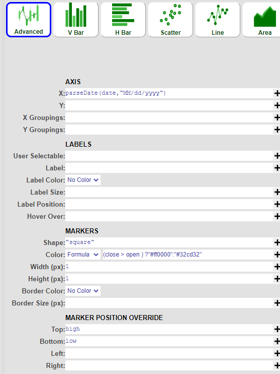
Using the advanced chart option, create the intraday range (vertical line) layer first with the following parameters:
1 AXIS X date (or use the parseDate() formula if the date field is a string ) 2 MARKERS Shape "square" 3 MARKERS Color - Formula (close > open ) ?"#ff0000":"#32cd32" 4 MARKERS - Width 1 5 MARKERS - Height 1 6 MARKER POSITION OVERRIDE Top high 7 MARKER POSITION OVERRIDE Bottom low -
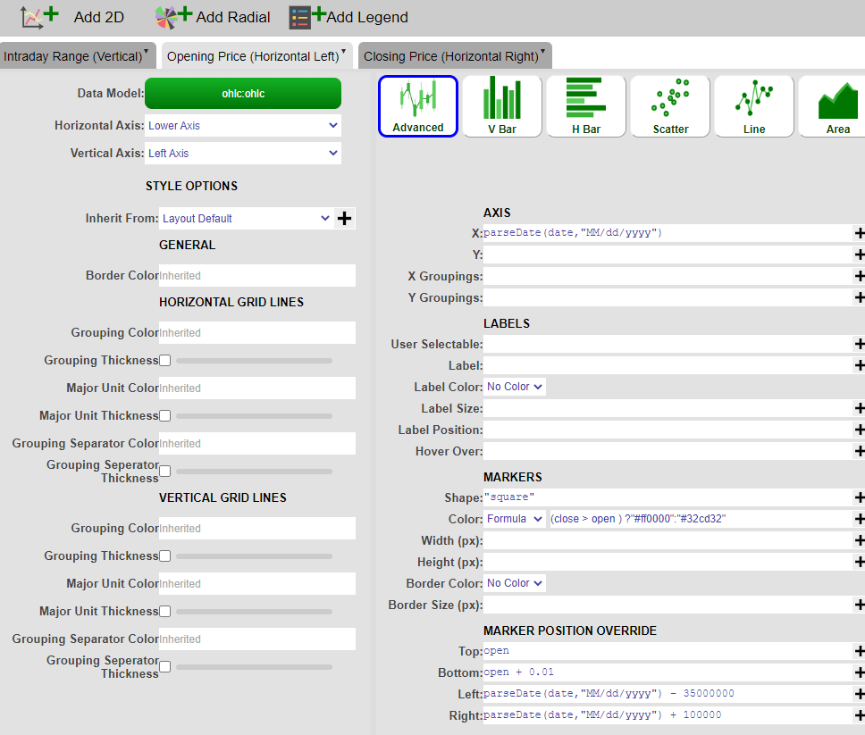
Click on 'Add 2D' and add a new layer on top of the chart. (Opening Price - Horizontal Left Line layer)
-
Using the advanced option as well, create the Opening Price layer with the following parameters:
1 AXIS X date (or use the parseDate() formula if the date field is a string ) 2 MARKERS Shape "square" 3 MARKERS Color - Formula (close > open ) ?"#ff0000":"#32cd32" 4 MARKER POSITION OVERRIDE Top open 5 MARKER POSITION OVERRIDE Bottom open + 0.01 6 MARKER POSITION OVERRIDE Left date - 35000000 7 MARKER POSITION OVERRIDE Right date + 100000 -
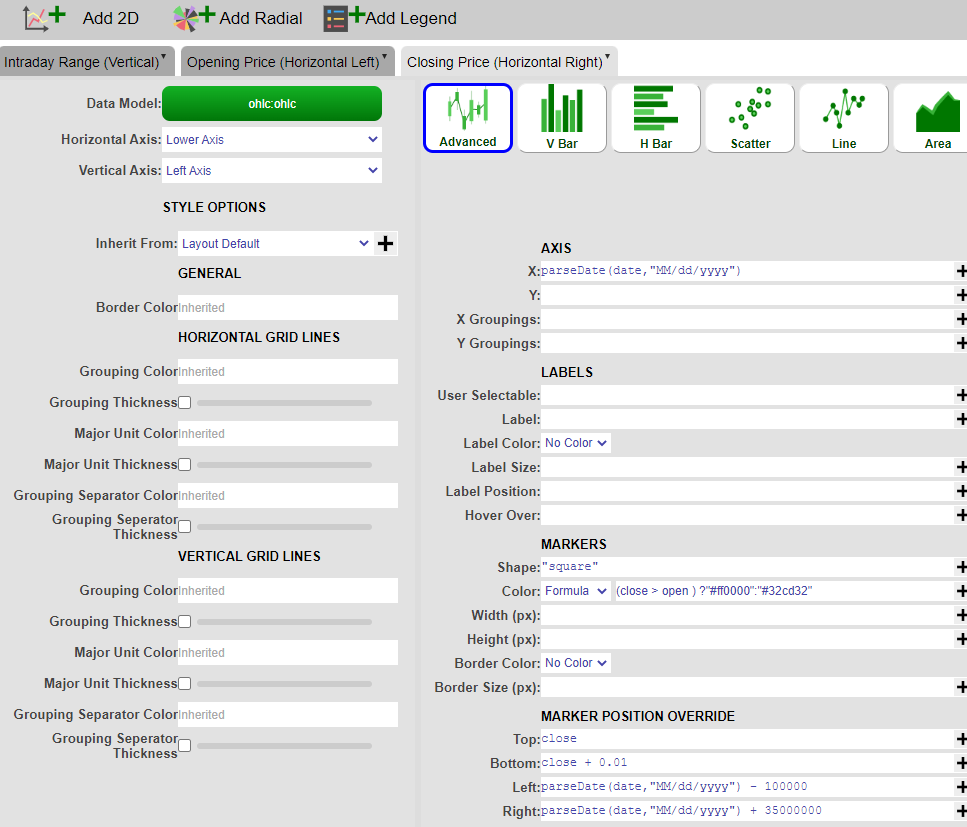
Click on 'Add 2D' and add the 3rd layer (Closing Price - Horizontal Right Line layer). Using the advanced option as well, create the Closing Price layer with the following parameters:
1 AXIS X date (or use the parseDate() formula if the date field is a string ) 2 MARKERS Shape "square" 3 MARKERS Color - Formula (close > open ) ?"#ff0000":"#32cd32" 4 MARKER POSITION OVERRIDE Top close 5 MARKER POSITION OVERRIDE Bottom close + 0.01 6 MARKER POSITION OVERRIDE Left date - 100000 7 MARKER POSITION OVERRIDE Right date + 35000000 -
Click on 'Apply' and 'OK' and you have successfully created an OHLC chart.
Realtime Chart
Subscribing your datamodeller with its own feed makes it a realtime datamodeller, which can be used to create a realtime chart.
-
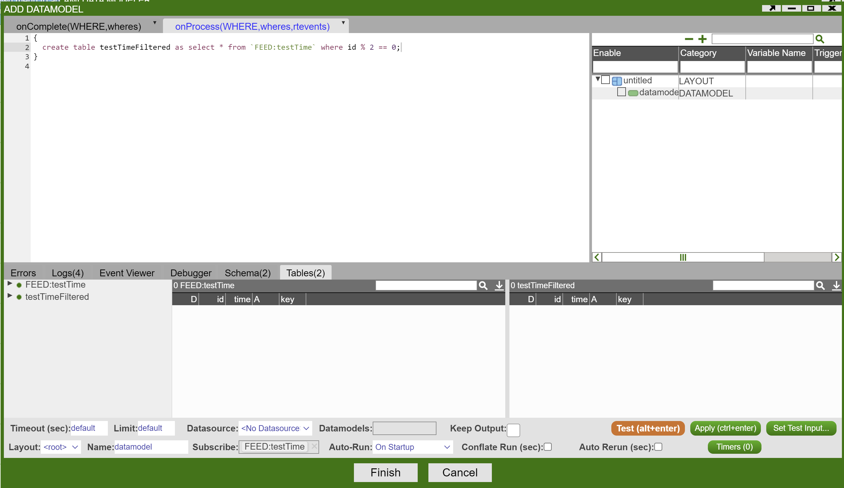
Suppose you have a real time table(feed) called "testTime". Right click on the feed -> Add Datamodel:

-
Now that the datamodeller subscribes to its own feed, configure the datamodeller based on the realtime feed. For this example, get every other id value:
-
Right click on the Datamodeller icon -> Add Table/Visualization Form -> Select a table in your chosen datamodeller

-
Choose any chart type of your interest. For this example, choose a bar chart.
-
Edit the plot configuration -> submit. The realtime bar chart is ready to go.
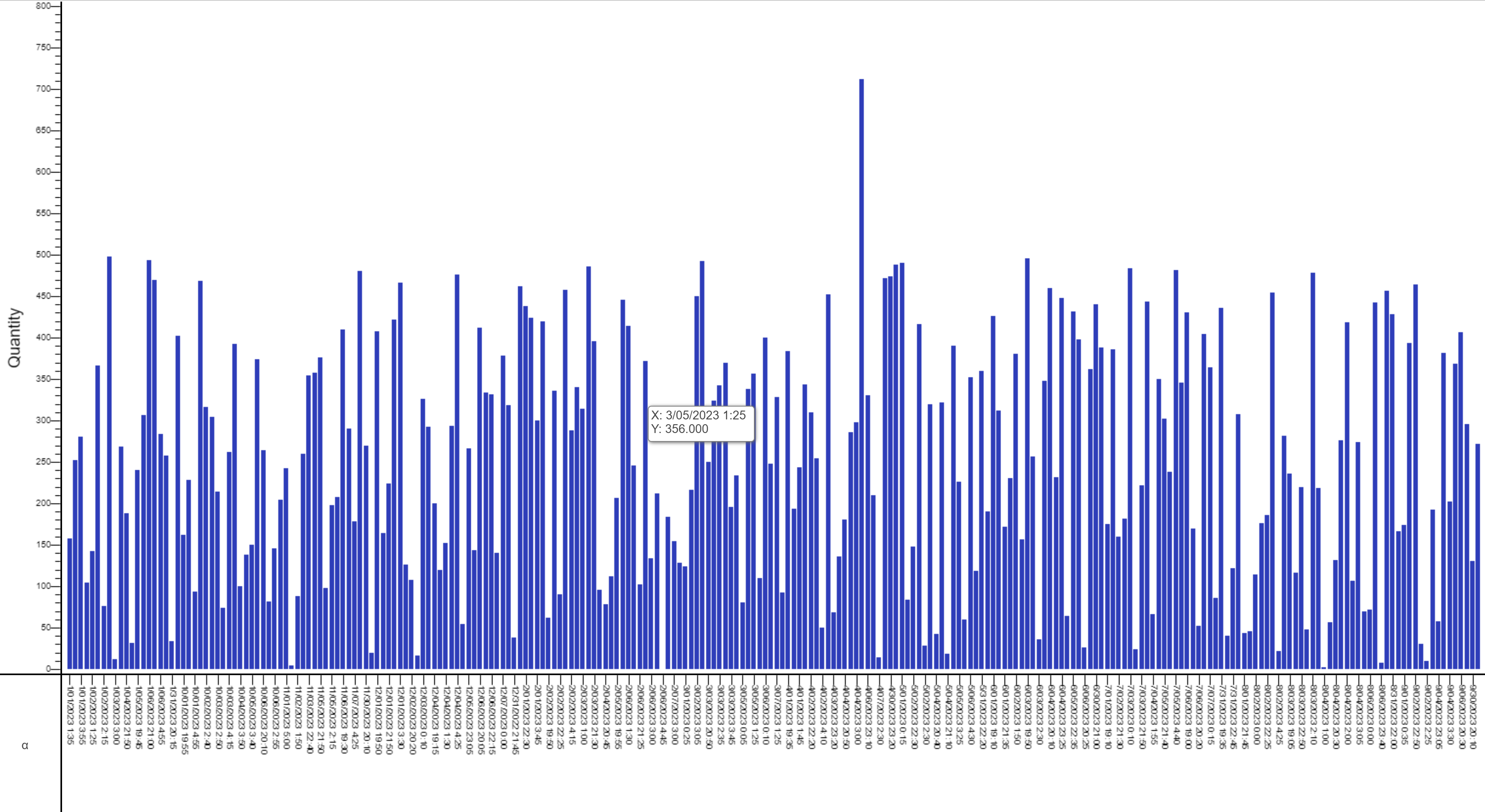
The above chart is redrawn on every update in the feed that the realtime datamodel is based on. Alternatively, if rerunning the datamodel on every update is very expensive, it is possible to have the datamodel conflate its runs. This will make it so that it runs only once in the specified time period. This can be controlled by the Conflate Run (sec) field in the Edit Datamodel window.
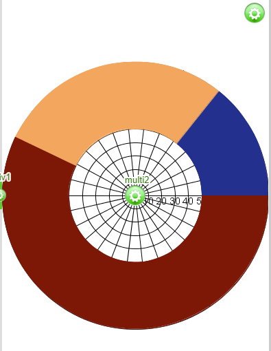
Hollow Pie Chart
Assume you want to create a hollow pie chart out of your sample table Sample(Symbol String, Quantity Int).
1. Select your datamodel -> 2D Chart -> Pie Chart:
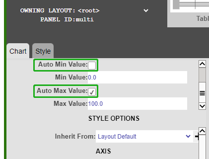
1. Uncheck Auto Min Value and Auto Max Value
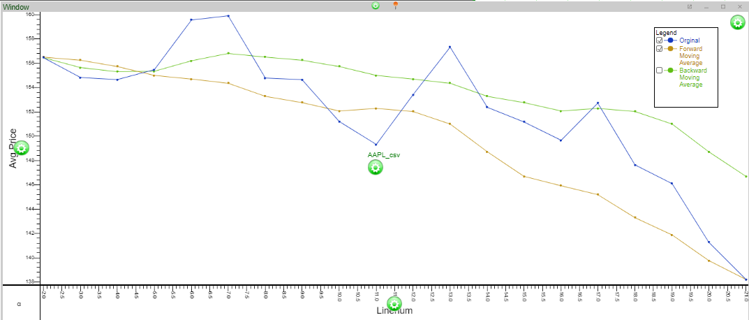
Moving Average Chart
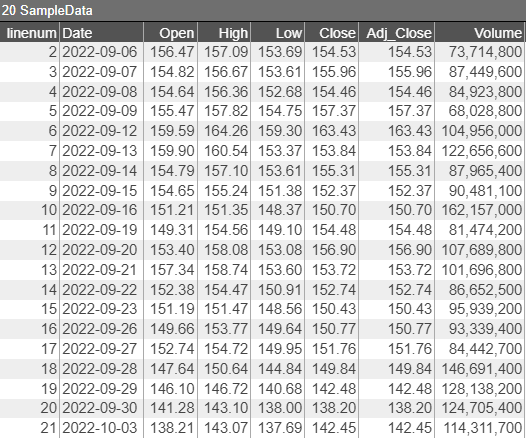
This example uses some sample stock data to demonstrate the moving average chart.
In the table SampleData there are 20 days of stock data. Create a seven-day moving average out of `Open`.
Correlation Heatmap
-
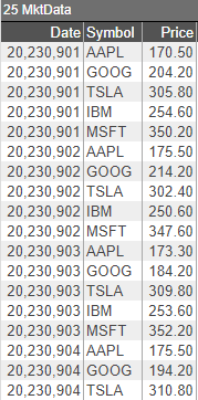
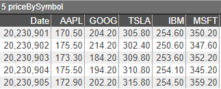
Let's use the data below to create a simple correlation heatmap over the prices of different symbols over 5 days
-
Transpose the table
-
Generate the heatmap schema and initialize
-
Get all pairs of Symbols
-
Iterate over each pair of Symbols and calculate the correlation index
